
There’s been a lot of press the past few days about Elon Musk and some pointed barbs he threw Apple’s way. This CNET piece did a good job pulling all these together.
So it is, perhaps, with an interview in which Tesla CEO Elon Musk gave to Germany’s Handelsblatt. In it, he suggested — jokingly?– that the Cupertino, California, tech titan hires Tesla’s engineering castoffs.
“Did you ever take a look at the Apple Watch? No, seriously,” he said of Apple’s alleged foray into cars. “It’s good that Apple is moving and investing in this direction. But cars are very complex compared to phones or smartwatches.”
And:
“Yo, I don’t hate Apple,” he first tweeted. “It’s a great company with a lot of talented people. I love their products and I’m glad they’re doing an EV.”
And:
Musk followed up with another tweet addressing his views on the Watch. “Regarding the watch, Jony & his team created a beautiful design, but the functionality isn’t compelling yet. By version 3, it will be.”
It’s this last bit that I truly take issue with. I do indeed find the current incarnation of Apple Watch compelling. As is, today.
Take a look at this screenshot:
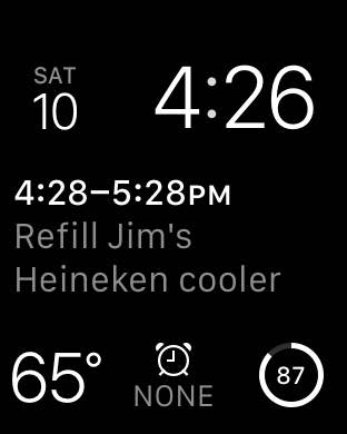
This is my current Apple Watch setup. It shows me the time, day, and date at the top. At the bottom, it shows the current outside temperature, any alarms (none were set when I took this), and remaining battery. In the middle is my Fantastical calendar complication, showing the next event on my calendar (Jim is adamant that his cooler always remain topped off. For emergencies.)
All of this functionality is rendered in a font that is large enough and clear enough for my aging eyes to see with no problem. And with watchOS 2, I have an incredible array of 3rd party complications from which to choose to customize my experience.
My watch looks good in the gym, in a business meeting, out at dinner, no matter how casual or fancy.
With the flip of a wrist and, perhaps, a tap or two, I can interact with Siri, control my music, set an alarm or timer, browse my email, send and receive texts, talk on the phone, and so much more.
The “functionality isn’t compelling yet”? To me, the Apple Watch is a remarkable piece of work, a miracle of design and technological prowess. We must have a different definition of compelling.
I think your display is functional – I use a similar layout – but far from beautiful. It looks clunky, kind of like the first digital watches.
Mine is quite similar. I like the Apple Watch. I can imagine it being better in version 3 for sure. And I admire Musk greatly for his technical innovations, ambitions to change the world and all that. But remember, he also created Paypal. Talk about something lacking in value at the beginning, and being problematic in multiple ways.
I’m not sure how you combined beautiful with presenting a lot of information on screen.
Tesla Model S ain’t beautiful so what does Elon know about aesthetics?
I don’t need a watch to tell me when to fill the beer cooler. Other examples may prove more useful.
I,m thinking of the remainder to purchase ice.
My sentiments as well. People that are expecting or needing a “killer app” clearly are not getting what the Watch is about. Mine’s on my wrist 12 hours a day and provides great utility. Tells time, too…
“Jim is adamant that his cooler always remain topped off. For emergencies.”
In Canuckistan, isn’t a “cooler” also known as “outdoors”?
I’m on the fence about Watch. If I look at the screenshot int he post it only has one thing on it that’s not a standard watch thing (time, date, etc), the reminder. That doesn’t scream need to me.
However, I’ve been driving around to places and remembered something that I needed to do and been able to say “Hey Siri, remind me to… ” and it happens. Yeah, the would work with just the phone…. if the phone wasn’t in my pocket. Is that a NEED? Not really. But it is very convenient.
What Musk and other Watch critics miss are two key points.
First, the you can’t ship version 2 and version 3 if you never ship version 1. The S is a great car, but it’s the second Tesla. The Roadster was the first and let them learn. The 6S is a great phone but it doesn’t exist without the first iPhone and all the iterations from then to now.
Second, that wearables will likely not have killer apps but will slowly add bits and pieces to our lives that over time will profoundly change how we do things. See my example above. Heck the modern smartphone itself illustrates this too. How we interact with the web and the world is vastly different today than 10 years ago but what’s really THE killer app for phones? I’d say there is none aside from their nature – connected and always with us. Wearables will likely go the same way.
The (so far very few) Apple Watch owners I’ve met really loved it. And my brother wants one. But to me, it really hasn’t been compelling. I bought every generation of iPad, almost every second generation of iPhone, tons of iPods (mostly the clickwheel type), and I bought AppleTVs for everybody in my family. But honestly, I agree with Musk about the watch. Just not that compelling yet for me. My iPhone trained me not to need a watch; the Apple Watch hasn’t undone that. No doubt it’s the smallest they could make it, and most likely no one could have made such functionality smaller. But it really isn’t a very pretty watch. Even with rounded corners, every time I see one, I think, “Wow, that’s kinda fat.” And honestly, that watch face you showed? Cluttered and unlovely. If I hadn’t already come to the same conclusion as Musk, that might have tipped me in his direction. I suspect I’ll own a generation 2 or 3 watch. But it’s the first of the personal devices I haven’t been onboard with since day 1.
Have you seen the 38mm in person? Its shockingly small. Almost every single person I’ve shown mine to has been surprised and said “wow, this thing is tiny in person.” And no, its almost certainly not “kinda fat.” I have very thin wrists, and it looks completely normal sized on my wrist. Its one of the few watches that actually looks normal on me. Most mens watches dwarf my wrist. I think Apple absolutely nailed both the physical dimensions as well as the screen sizes.
The screenshot also looks cluttered and ugly design-wise, because all Watch screenshots do. The physical hardware is an actual part of the software design. They were clever enough to integrate the physical bezels into the software design, forgoing margins and pushing the content to the edges. So it looks odd viewed outside of the Watch. You really have to see the thing in person. That watch face is my favorite, its very functional but orderly and well laid-out. The amount of customization and information density is pretty great for such a limited space.
it’s a good thing this screenshot is the best and most compelling argument for the Apple Watch. oh, wait, it isnt.
i cant imagine how anyone could consider the 38mm too fat or bulky. it’s so outright delicate looking i returned it for the 42mm.
the lack of color in jim’s screenshot make it kinda hard to separate data. i use color on my Modular watch face. but usually i use the Utility face
Guess I’ve seen the 42mm. But I’m giving my honest reaction to a device that (as an Apple fan since my first PowerBook 100), I intrinsically want to like. I disagree strongly that all watch screenshots look ugly. Maybe all smartwatch screenshots, but there’s a ton of regular watches that look exceedingly cool and slim both in photos and in person. I suspect partly it’s the rounded bezel that makes me see it as chunky. In the past, Ive has tricked my eye into seeing Apple devices as thinner than they were by tapering the bevel. They didn’t do that this time (maybe they couldn’t, due to internal constraints; or maybe he just wanted a different aesthetic). Whatever the reason though, I think the theme of your post is just reinforcing what I had said, which is that everyone I’ve met who had one loved the hell out of it, but I still don’t find it a compelling product. Whether you’re right or not, this is the first Apple product in ages that I didn’t feel in my bones what I would do with it and why I needed to have it. I hope that isn’t the start of a trend. (I’m pretty excited about the iPad Pro, though. Now if people will just make some pro apps for it. It has enough juice to do 3D, I think. I want to do some drawing and painting, but I really want to do 3D on an iPad. I’m worried no one will invest $$ in pro apps outside a subscription model because iOS has gotten everyone’s expectations for the cost of an app so low. Got my fingers crossed though).
so youve seen the 42mm in person, then?
i disagree strongly w/ the statement that its really not a pretty watch. especially since evaluations of pretty are pretty subjective.
as for use — it’s not for telling the time. i havent word a watchin decades. i got it for the activity tracking, notifications, pay, and wireless music.
Three people I know have an Apple Watch. Although I don’t find them ginormous, there’s just something about them that strikes a tiny chord of disappointment in me when I see them, and it’s the rounded edge I’m looking at when it happens. I’m curious about the music though. You’re doing what exactly, listening through bluetooth headphones and using controls on the watch face to navigate? Does that work pretty good? I’m an audiobook man, myself. So there’s much less in the way of changing track. But at the gym listening to regular music… hmm…
I’ll take another look at them, then. Since I only know 3 people with them (and they’re not close friends, so I haven’t seen an Apple Watch in action more than a half dozen times) (and nobody was wearing the black one, which is what I’d have gotten), I’m probably more thinking of what they look like in the displays in the stores.
When I said “screenshots,” I meant screen grabs from the watch OS itself. Like the image above of the watch face, which is just a screen grab and not a picture of the device itself.
For the reasons I explained. The physical bezel is an integrated part of the software design. There are no use of margins in watchOS, so that they could put the content on-screen edge to edge. Which makes all watchOS screen grabs kind of funky when viewing them outside of the Watch itself. The layouts don’t look “right” unless you’re viewing them on the Watch display, or at least a bezel added around the screen grab.
Which I think is one of the clever things done in watchOS, and highlights Apple’s strength of designing the entire product. Getting rid of the margins gives extra screen space in the same sized screen, while still having a balanced visual appearance (when viewed on the Watch display).
Let’s be honest here, Apple Watch is a bad first generation device. Design aside, it’s not good at anything. It’s a health monitor that cost $350+ and doesn’t really do anything your iPhone can’t already do, except tell you your BPM. The interface is clunky. The touch is atrocious, it’s about as bad as Android devices in 2008
I’ll never understand people like Musk. Or this here reaction to his drivel. Isn’t it quite obvious that he had (has?) a chip on his shoulder about losing employees to Apple and was (is?) looking, very clumsily so, for a way hit back at Tim & Co. Why feed his bruised ego by deigning his dimwitted remark with an actual article? A 140-character Tweet I might’ve understood, but an article?
I use Apple Pay with my iPhone and love it. The only problem is how few vendors use it. There’s a couple of places (like Whataburger) which seem to have appropriate readers but they’re disabled.
With an iPhone, the security is verified via fingerprint. How is security verified on the watch, though?
Q: Why does it take Dave an hour to fill Jim’s Heineken cooler?
A: One for the cooler, one for me. One for the cooler, one for me. 1 for the coolr, 1 4 me. Wah fah clr, wah fa meeeee! ZZZZZZZZ