
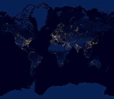
We’ve all seen the famous “Earth at Night” composite image showing our planet at night and how much light there still is, sometimes in unexpected places.
Now Google has a new global view of Earth’s city lights that is a composite assembled from data acquired by the Suomi NPP satellite.
With this version of the image, you can even zoom in to get a better (if not necessarily higher resolution ) and closer view.
Crazy difference between the Koreas.
The difference between North and South Korea is pretty shocking.
What shocked me most was not the land — but the ocean. Look at the oil production in the Gulf of Mexico and off of South America.
Holy crap. I didn’t think there was so much of it.
Another thing I didn’t expect that Canada, with about 35 million people has more light than all of Africa, which has about a billion more people.
What the hell is going on in Western Australia? I don’t recall there being a mass exodus from the east coast to the middle of the Gibson desert.
There are a lot of lights in Russia (kinda north of Kazakhstan) where there aren’t a lot of city names or roads. I wonder what’s going on up there.
Ok, I just asked my Russian coworker. He said it’s all oil and gas rigs. There’s a huge pipeline that goes through Nizhnevartovsk and Khanty-Mansiysk.
I feel that you’re just smashing random letters together.
You wouldn’t believe how hard it was to type those correctly.
Yes I would!