
Moving Brands partnered with HP as their lead agency to set a creative vision for the HP brand. The vision was to transform the world’s biggest technology company into the world’s most powerful brand. HP would become the blueprint of a moving brand, built for a moving world.
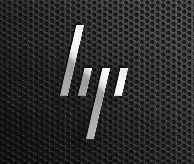
How am I suppose to know this says HP? It looks more like it says
hy
Looks a bit like a hand gesture…
I don’t hate it on sight.
I don’t know that I love it yet. I probably don’t, because it’s too abstract to say much. But I don’t hate it.
Definitely doesn’t look like it says ‘hp’.
I confess, I like it.
But how will this improve their products?
My first reaction is that this is a brand that doesn’t care much about communication, because the letters are so messed up that they are illegible. It also doesn’t look very friendly. I guess they are hoping that it will become so iconic, it won’t matter that it’s hard to read.
But wait, there’s more (or ‘less,’ depending on how you look at it):
According to the link, by 2021 the logo will be further simplified, reduced to just the one long stroke. Anyone typing a / will be sued. 🙂
Is HP partnering with Black Flag?
But seriously, just a little rounding on those shorter bars to help letter-fy would be great (like in the last sketch in the first pic inthe article). If they want to go to this later, it would be an easy transition.
Upside down, it looks like a new logo for Dairy Queen.
They’ll run into trouble with prior art. Slashdot already has dibs on /.
Huh? How do you write the letter y?
and a spray painted front grille from a Mac Pro .. nice 🙂
Trying to figure out how someone who really doesn’t recognize HP would interpret those slashes. My mind understands it says HP because I’m very familiar with the previous incarnation(s) of the logo. But what if I wasn’t?
It’s a barb wire knot.
Then you wouldn’t have a clue.
They want to be the Transformers of desktops…
More like “lyi”…
so what they will put a pic of Megan Fox’s butt on the boxes to get the guys to buy.
especially if you have it upside down
That will probably work…
“Brand” is completely meaningless unless the company fixes it’s internal problems and culture to actually represent the “Brand”. You can change your name and promote a new brand identity like Comcast did with Xfinity but you can screw it up like Comcast because nothing really changed except for the name! Xfinity is nothing more than Comcast with a new name… Doesn’t change my opinion of the company at all…
Seems this was a pitch to HP and it’s not been selected. We don’t even know if they even showed it to HP and it was just an exercise. The marketing firm removed the HP brand segment from their website…
This new logo looks like morse code.
I wonder how long it’ll take till it resembles the S-O-S signal.