Design

A custom, hand-made gift for the Technology Evangelism group at Apple

Josh Tidsbury, Apple:

I have the great honor of working as part of the Technology Evangelism group at Apple. Involvement in the annual WWDC conference is one of the key efforts by the team each year, and I was really taken by the conference this year. The developers I met were simply amazing, the team behind the conference immensely talented, and the conference branding and theme also spoke to me very deeply.

As someone who came into technology from the arts, and endeavors to bring the best of both disciplines into everything I do, it struck a chord in my heart.

And:

I wanted to create something of a keepsake for each of the other members of our team as a personal gift to each of them. I’ve always loved the aesthetic of the Apple Design Award, and wanted to create something of an homage to that design, but using my favourite material: wood.

Read the post, take a look at the pictures. What an amazingly thoughtful gift. So cool.

Susan Kare on coming to work for Apple, designing icons and type

[VIDEO] The video embedded in the main Loop post is from a few years ago but, if you are interested in icon design and/or Apple history, carve out some time and give it a look. Susan Kare was the original Mac icon and type designer. Lovely stuff, worth the repost.

Apple’s Ive regains management of design team after 2 years

Mark Gurman and Alex Webb, Bloomberg:

Apple Inc.’s Jony Ive, a key executive credited with the look of many of the company’s most popular products, has re-taken direct management of product design teams.

Ive, 50, was named Apple’s chief design officer in 2015 and subsequently handed off some day-to-day management responsibility while the iPhone maker was building its new Apple Park headquarters in Cupertino, California. “With the completion of Apple Park, Apple’s design leaders and teams are again reporting directly to Jony Ive, who remains focused purely on design,” Amy Bessette, a company spokeswoman, said Friday in a statement.

Is this much ado about nothing? Was there a plan for Sir Jony to step away, a plan that’s now changed? Or was this more a shift of focus, first to getting Apple Park to completion, then back to work as usual?

iOS 11.2 rolls out some emoji updates

I think Emojipedia is a terrific resource. If you’ve not spent time here before, jump to the linked page, showing the emoji changes that came with this iOS release. First, there’s there’s the high resolution images of the 17 emoji that have changed.

To get a sense of these, take a look at the tumbler emoji. Here’s the old, iOS 11.1 version. And here’s the version updated for iOS 11.2.

I love the attention to detail here. The old one looks like a bit flat, and the scotch (or whatever is in it) looks cloudy. The new one looks more realistic.

[UPDATE: Apparently, the tumbler emoji was updated, then reverted back to the old version, then updated back to the new one, perhaps as a result of a QA oversight. Regardless, nice to see the design improvement.]

Another thing to note about this page is “all, changed, new, removed” links. Each gives you a different, useful view into the current emoji.

And, if you are interested, you can scroll down and tap on the links for previous versions of iOS, to see what was new with those releases. Good stuff.

Create custom logos with free online tool

This is a nice tool for playing with logo ideas, homing in on a design you might then pass along to a professional designer to refine.

To get started, click the Make a Logo link in the top bar. Fun and useful.

Apple’s gorgeous Chicago riverfront store opens today

Follow the link, take a look at those images, especially that last one. This is an incredibly beautiful storefront, perfectly incorporated into the surroundings.

Props to whoever did the site planning. Just wow.

iPhone, Apple Pencil, and the need to double the refresh rate

UPDATE: Feedback is, this is just point-by-point wrong. We try never to delete posts, or I would delete this one, but at the very least, file this one under, here’s a source I’ll not post from again.

Motley Fool:

One of the sources said that Apple will need to significantly improve the performance of its mobile processor technology to support a digital pen. The source also added that Apple “had to compromise on some touch performance of the latest iPhone X largely due to the less advanced chipset.”

And:

With the latest iPad Pro tablets, according to the company, when a user writes on the screen using the Apple Pencil, the screen begins to scan for input at a rate of 240Hz, or cycles per second. This is twice the peak refresh rate of the display (which is 120Hz).

And:

Apple reportedly tested a high-refresh rate display on the iPhone X (Apple calls such displays ProMotion displays) but ultimately chose not to ship the device with such a display. Instead, the iPhone X shipped with a display that could only refresh its contents at 60Hz — half that of the current iPad Pros.

In effect, the article makes the case that the current lineup of iPhones has too slow a refresh rate to support the Apple Pencil.

Using math to design a more accurate measuring cup

If you love to cook, check out this kickstarter. Smart design let’s you measure ingredients more accurately. Not sure I’d lay out $24 for a measuring cup, but I know cooks/mixologists who would jump on this.

The math and the story behind the design are both interesting.

A Shazam for the art world

Gunseli Yalcinkaya, Dezeen:

Smartify launched at the Royal Academy of Arts in London last week. It has been described by its creators as “a Shazam for the art world”, because – like the app that can identify any music track – it can reveal the title and artist of thousands of artworks.

It does so by cross-referencing them with a vast database that the company is constantly updating.

I love the idea of this app. One key difference between Smartify and Shazam is that the creators/sellers do the database updating in Shazam, while Smartify does the updating themselves. While Shazam is a general purpose solution, Smartify is more collection specific, working with museums, for example, to tag all the items in a specific gallery.

Looking forward to taking it for a spin the next time I’m at MoMA. Wondering if Smartify can handle sculpture and other 3D artforms.

Twitter working on #SaveForLater tweet saving tool

Alex Kantrowitz, BuzzFeed News:

A “save for later” option is coming to Twitter.

The company is working on a bookmarking tool that will allow you to save Tweets and return to them in a dedicated section the product, its head of product Keith Coleman said in a tweet Monday.

Here’s a tweet showing the current design in action:

https://twitter.com/jesarshah/status/917538321693261824

Tap the play button in the center of the tweet to watch this prototype video.

In a nutshell, you tap the ellipsis below a tweet to bring up a Add to Bookmarks button, saving the tweet for later.

Apple reveals new emoji for iPhone and iPad

.

Apple press release:

Hundreds of new emoji, including more emotive smiley faces, gender-neutral characters, clothing options, food types, animals, mythical creatures and more, are coming to iPhone and iPad with iOS 11.1.

The new emoji are gorgeous. To me, they harken back to the days of skeuomorphism. Jarring to see the shiny, shadowed, 3D emoji next to the intentionally flat iOS interface. Which way are we going?

No matter, head over to the Apple press release, check out the emoji for yourself. A vampire!

Thoughts on new Google phone, PixelBuds

Lots of news from Google yesterday. Among the product announcements are a pair of new phones, the Pixel 2 and Pixel 2 XL, and an AirPods-like set of wireless earbuds, the PixelBuds.

A few thoughts: […]

Details on the iPhone X notch interface

A detailed post from Max Rudberg, lots of pictures, makes me feel more comfortable with the notch itself and how it might look in different situations.

A few highlights:

Regardless of your feelings for the notch, the reality is that to do a near edge-to-edge screen on a phone in 2017; you need to make place for sensors and speaker. The technology to hide them behind the screen simply is not here. We’ve seen different manufacturers choose different solutions to the problem. This is the one Apple chose, so let’s work with what we got.

That last bit is exactly right. These are the cards we’ve been dealt. Let’s work with that.

The familiar 20 pt tall status bar, the same height it’s been since the first iPhone, is now 44 pt tall on iPhone X.

That’s more than twice the height but, of course, it’s now split in two. Not our space to play with, so no reason for developers to worry through what will fit in the so-called horns.

If nothing else, just scroll through all the examples. This is the (at least short term) future.

[H/T Fabrice Dubois

The LTE Apple Watch and the red dot

Yesterday, we posted the Hodinkee review of the cellular Apple Watch, with some focus on the red dot placed on the edge of the Digital Crown.

To add to the discussion, this from Matthew Achariam’s Red Dot blog post:

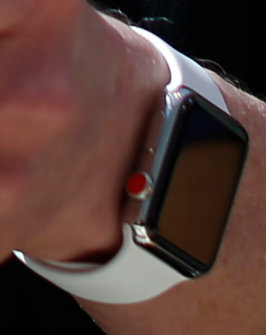
We got an unknowing first glimpse at the latest design of the Apple Watch more than two years ago. No less, adorned on the wrist of Tim Cook was a stainless steel watch with a bright red crown cap.

This pic is a closeup from the original Reuters’ pic of Tim’s wrist from a few years ago:

Note the red dot. More from Matthew:

Leica’s brand is iconic due to their distinct red mark which it has used since 1913. It is instantly recognizable.

And:

French fashion designer, Christian Louboutin, employs a similar technique, coating the soles of the shoes he creates in a bright glossy red.

And:

In horology watchmakers use color as a tool to differentiate between editions and various releases constantly. Industrial designer and long time Ive collaborator, Marc Newson, has created several watches that Ive has drawn inspiration from for the Apple Watch. Newson’s Hemipode watch also features red caps, adorned on secondary buttons.

And:

By nature, changing anything that touches so many people always elicits a reaction. If you want an LTE enabled Apple Watch, you’re getting a red crown cap—a decidedly non-neutral color is now the only option. In the past, you had some semblance of choice in getting a non-neutral color. This small red dot breaks the modular styling of the watch. For better or worse, the watch design team decided that this marker and what it represents was of greater importance.

A small thing, perhaps, but the red dot is an important, distinguishing design element.

iOS Control Center: Understanding how the WiFi and Bluetooth toggles work

John Gruber, commenting on the fact that the WiFi and Bluetooth buttons in Control Center no longer act as on/off switches:

This is an interesting feature, but I think it’s going to confuse and anger a lot of people. Until iOS 11, the Wi-Fi and Bluetooth toggles in Control Center worked the way it looked like they worked: they were on/off switches. Now, in iOS 11, they still look like on/off switches, but they act as disconnect switches.

Off the top of my head, I would suggest making them three-way switches: on and connected, on but disconnected, and off.

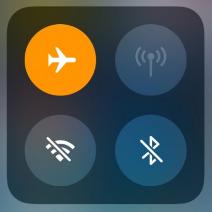
Completely agree. This setup is confusing. As John points out, when you tap the WiFi button, WiFi is left on, but you are disconnected from your current session. Tap it again, you are reconnected. The icon goes from a blue background to a grey background, and back to blue when you reconnect.

To complete the picture, there is a third icon state. Take a look at what happens when you turn on airplane mode:

The grey background with the line through it shows that Bluetooth and WiFi are now disconnected. In Airplane mode, a tap on the WiFi icon goes from disabled to connected (assuming there’s WiFi to be had), from grey with a line through it to the blue background.

Confusing. But once you get the sense of it, it’s pretty clear what’s happening.

Adding tiny, in-line charts to your text

This is a little hard to explain, so take a moment to jump to the AtF Spark web site. Their examples make the concept quite clear.

In a nutshell, you download a font that lets you use a simple markup to embed cool little charts in your text. Terrific idea.

Add a splash of color to your Apple Watch

Add a colored accent to your Apple Watch to exactly match the color of your Sport band. This came up because the Series 3 Cellular comes with a red dot on the Digital Crown.

This is pure fashion, a thing for people who own and wear different color bands for style. Unfortunately, it will not allow you to make calls on a non-cellular Apple Watch. Heh.

The annoyance and UI divide of push notifications

Joanna Stern, writing for the Wall Street Journal:

You’ve tried to silence unimportant push alerts but couldn’t figure out the complicated settings. Or worse, you thought you mastered the settings, but trivial messages still manage to sneak through like a mouse in an air vent.

Our attention has become such a precious commodity that apps, social networks and, yes, news outlets have deployed infuriating numbers of pop-ups to conquer it.

“Silence all the notifications!” is not the answer, however. Do I want Facebook to ding me to update my profile? Never. But I sure as heck want to be buzzed by the babysitter watching my newborn.

Notifications are a constant river of pain. But they do have value. The key is tuning them. The post does a nice job walking through some settings to give a sense of what lives where and what you can control.

But the article goes further, raising the point of the big UI divide between Apple’s (and Google’s) notification settings and those more fine tuned settings that live inside the biggest offenders, like Facebook.

The system-wide notification settings are found in the Settings app, listed under Facebook. These enable/disable notifications, and specify the various forms those notifications can take. But the detailed notification settings (notify me when someone likes my post, for example) are buried inside the Facebook app itself.

While this division is logical, Joanna makes this point:

The design of this system is confusing. Apple and Google should make it easier for us to get from system settings to individual app menus. It now takes about four taps to get from an app’s home screen to its notification controls.

And when you get there, you often see a long and messy list. The alternative is worse: a single on-off switch—or no notification control at all. Seriously, Lyft, I know when I need you, so alert me when my driver is arriving, not when there’s a sale on rides.

I think this is two separate issues. Nothing Apple can do about the granularity of an individual app’s notifications. That’s an app design issue.

But Apple could make it easier to get from an app’s notifications settings in the Settings app to the more detailed settings in the app itself. Perhaps via a link you tap in the Settings > Notifications > Facebook page that brings you to the sub-page in Facebook itself to tweak the more detail settings. To me, this consistency would be welcome.

John Gruber on Safari and favicons

John Gruber, on the reaction to a piece he wrote comparing Safari vs. Chrome on the Mac:

But really, taken as a whole, the response to my piece was about one thing and one thing only: the fact that Safari does not show favicons on tabs and Chrome does. There are a huge number of Daring Fireball readers who use Chrome because it shows favicons on tabs and would switch to Safari if it did.

The reaction was so overwhelming I almost couldn’t believe it.

And:

The gist of it is two-fold: (1) there are some people who strongly prefer to see favicons in tabs even when they don’t have a ton of tabs open, simply because they prefer identifying tabs graphically rather than by the text of the page title; and (2) for people who do have a ton of tabs open, favicons are the only way to identify tabs.

I use Safari for the most part, but I heartily agree. See for yourself. Here are two pictures, showing a bunch of tabs open, one in Safari, the other in Chrome. Which makes it easier to identify individual tabs?

Solid point, John.

Resizable Home button and more riches from the HomePod leak

Ben Lovejoy walks through the latest revelations from Steve Troughton Smith’s dig through the recently leaked HomePod firmware.

Here’s the first tweet:

https://twitter.com/stroughtonsmith/status/895486535742705664

Note the reference to a resizable Home button. When the implementation is in software, rather than hardware, there’s ultimate flexibility. Not sure if there is actually a plan to allow the user to resize the home button, but I think a larger target would be a terrific assistive feature.

Here’s the second tweet:

https://twitter.com/stroughtonsmith/status/895558456773496832

Check out the mockup in Ben’s article. Looks remarkably like the iPhone 8 dummy in this post.

Embracing the notch

Max Rudberg:

Apple’s accidental release of the HomePod firmware prompted Steven Throughthon-Smith’s to go digging through and uncovering a lot of exciting pieces on the upcoming high-end iPhone, codename D22. Allen Pike then had an interesting take on what that new form factor could mean for the UI.

Max took Allen Pike’s thoughts on the notch and its impact on the nav bar (here’s my summary, with a link to Allen’s brilliant post) and worked up some beautiful, high-res mockups.

Lovely stuff.

[Via MacStories]

iOS 11, nav bar design changes, and the upcoming iPhone Pro

Fantastic speculation from Allen Pike.

The nav bar is the strip at the top of the display that allows you to navigate between views. It features buttons like “+”, “Edit”, “Done”, “< Back”, etc.

iOS 11 has changed the design of the nav bar, moving the title from the center of the nav bar to its own line, left justified, and to a much larger, bolded font size.

Allen posits that this change was made to accommodate the disappearance of a physical home button and the corresponding shrinking of the bezel, the growth of the screen to just about the bottom of the phone.

In Allen’s view, the nav bar will move to the bottom of the screen, on either side of the virtual home button.

I think he’s on to something. Read the post, look at the pictures to get your own sense of this.

Learning to draw icons: Marc Edwards’ excellent vector speed runs

A few months ago, I posted a link to an article with a small series of vector speed runs, animated GIFs showing how to use a drawing program, like Adobe Illustrator, to quickly create various icons.

The author, Marc Edwards, has since significantly increased his portfolio and gathered them on a single page. If you are interested in learning how to draw in this way, or if you spend any time creating icons, bookmark this page and spend some time watching Marc’s technique.

This is a wonderful contribution to the community. Please pass it along.

How Jony Ive masterminded Apple’s new headquarters

Christina Passariello, WSJ. Magazine:

Apple Park is unlike any other product Ive has worked on. There will be only one campus—in contrast to the ubiquity of Apple’s phones and computers—and it doesn’t fit in a pocket or a hand. Yet Ive applied the same design process he brings to technological devices: prototyping to minimize any issues with the end result and to narrow what he calls the delta between the vision and the reality of a project. Apple Park is also the last major project Ive worked on with Steve Jobs, making it more personal for the man Jobs once called his “spiritual partner.”

So far, so good. But:

With Apple Park, Ive is ensconced as master of the house, which means he has also inherited the burden of proving that Apple’s best days aren’t behind it. Apple hasn’t had a breakthrough product since Jobs died. The iPhone’s sales growth has stalled, and expectations are high that a 10th-anniversary phone will arrive later this year and will be markedly more advanced than previous versions. In other technologies, from digital assistants to driverless vehicles to augmented and virtual reality, Apple seems to lag other tech giants, including Google, Amazon and Tesla. Its new voice-activated speaker, HomePod, unveiled in June, will arrive on the market in December, three years after Amazon’s Echo.

This “what have you done for me lately” journalism does a disservice, is incredibly shortsighted. Products like Apple Watch and AirPods aside, spend some time with ARKit to see a true breakthrough at work, a technology that will enable a generation of developers to stand on the shoulder of giants, to build things that would have been impractical, if not impossible before.

But I digress:

Like other Ive designs, Apple Park seems poised to become an icon. In an acknowledgement that the campus will attract interest beyond its employees, there will be a visitor center and a store selling items unique to Apple Park.

And:

Ive joined Apple half a lifetime ago, in his mid-20s, when the company was at the brink of death. One of his early designs, the candy-colored iMac, was rejected by executives. Ive stashed it away until Jobs returned to the company in 1997, after a 12-year hiatus; it became an instant point of connection between the two men and was put into production soon thereafter.

And:

When J.J. Abrams was working on Star Wars: The Force Awakens, Ive mentioned that he “would love to see a lightsaber that is rougher, spitting sparks,” Abrams says. The director, who says he and Ive were already fans of each other’s work when they met at a dinner four years ago, applied Ive’s suggestion to character Kylo Ren’s weapon. “His lightsaber was as imperfect and unpredictable as the character,” says Abrams. (The inspiration is mutual: Ive told Abrams that he had the look of the original Stormtroopers in mind when he designed Apple’s earbuds.)

These quotes are just the tip of the iceberg. The article goes on to highlight many features of Apple Park intercut with quotes from Laurene Powell Jobs, Sir Jony, and Tim Cook. This is worth reading, worth the price of a Wall Street Journal subscription, or a trip to your newsstand to pick up a paper copy of the WSJ. Magazine (this is this week’s cover story).

Can you guess the rock band logo from just one letter?

Kottke:

Dorothy has designed a pair of posters of alphabets fashioned from rock band logos: one for classic rock and one for alternative rock. How many of the band names do you know? Me? Fewer than I would like.

This was both fun and incredibly difficult. Pick the genre you know best and give it a try.

Send a text and SFMOMA will reply with some art. Try it, it’s fun.

From the SFMOMA site:

Text 572-51 with the words “send me” followed by a keyword, a color, or even an emoji and you’ll receive a related artwork image and caption via text message.

For example, I texted the words “send me cake” and got a text back (in about 30 seconds) with a pic of Wayne Thiebaud’s “Dessert Tray”.

SFMOMA has about 35,000 pieces in their collection, only a fraction of that on display at any moment. This gives you random access to the entire thing. Fun!