I like this.
Design
Beard font
Imagine if I wrote all of the posts using this font.
Undesign 101
I associate “undesign” with websites where the design and content is scaled back to the bare necessities, allowing for the quick implementation of a simple yet professional design.
User Experience Design is alive and well
Rian van der Merwe:
I understand and appreciate the arguments these designers and writers are trying to make, but as someone who teaches introductory courses on User Experience Design, this plead to call ourselves something else (or nothing at all) is problematic.
A showcase of landscape photography
These are just so incredibly beautiful.
BMW i8 Concept Spyder
Barely a year after the unveiling of the BMW i8 Concept, BMW i unveiled the second variant of this innovative hybrid sports car. Like its Coupe sibling, the emotionally charged BMW i8 Concept Spyder combines intelligent lightweight design with the leading-edge drivetrain technology eDrive, while its open-top two-seater construction delivers an even more intense driving experience.
Impressive.

It’s about the experience, not features
Marcelo Somers:
Unfortunately, most organizations and even start ups still start with a list of features or things they want to build. People don’t consume features. They experience activities that add to their lives.
This is why Apple has been so successful. They build a problem to solve a problem and make our experience better. Consumers may not understand that’s what happening, but when they use an Apple product, they immediately get it.
Apple makes the difficult look very easy. There’s a lot going on under those simple-to-use apps, but they hide all of that from us so we can just get things done.
Heineken Design Challenge winners
Selected from a pool of six finalists among more than 30,000 entries from 100 countries, design student Rodolfo Kusulas of Monterrey, Mexico and freelance designer Lee Dunford of Sydney took top honors in the Heineken Limited Edition Design Contest, and their winning design will be featured on the brand’s 140th anniversary bottle.
No, no, no! I like my Heineken in a green bottle.

The 10 best startups from Y Combinator Demo Day
TechCrunch:
After talking to VCs and tech moguls, the TechCrunch teamed huddled up and picked these 10 companies as the best. They’re disrupting commerce, evolving how we communicate, and making our phones even more powerful.Here’s a cheat sheet to the startups we think are going to remodel big industries, change the world, or at least make a ton of money.
Some of these you’ll have no interest in but some of them might just peak your interest further.
Your own toilet paper with your own tweets on it
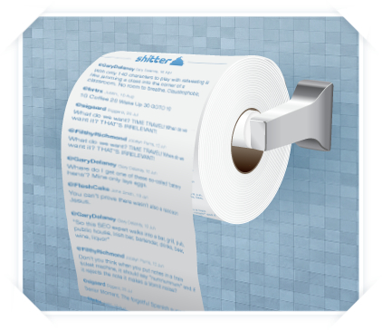 The Next Web:
Most of the tweets you read on Twitter are forgettable, at best. Some of them are pure gold and worth memorializing in some fashion. But how? A favorite? A retweet? Emailing them to a friend?How about printing them out on toilet paper and wiping your butt with them? Amazing idea right?
No…just…no.
Redesigning a Web site with personality
Aarron Walter:
Redesigning a website can be the seven-layer taco dip of hell. You’ve searched for inspiration on dozens of websites, captured screenshots, jotted down notes, consulted friends and colleagues, maybe even interviewed users. But despite your due diligence, your vision for the new website remains unclear.
Yeah, I’ve been there.
Big-ass iPad magazines
Michael Mulvey:
How about publishers stop making their magazines a big, fucking stack of PNGs and start to use actual text. The kind of text you can select and copy and paste. And look up in in-app dictionaries.
Exactly. Magazine publishers that use giant PNG images just don’t give a shit about their customers.
Login and registration form using HTML5 and CSS3
Stéphanie Walter:
In this tutorial we are going to create two HTML5 forms that will switch between login and registration using the CSS3 pseudo class :target. We will style it using CSS3 and an icon font. The idea behind this demo is to show the user the login form and provide a link to “switch” to the registration form.
I don’t like the login form much, but the transitions and idea to make it easier for the user are appreciated.
Free Glyph icon set
Some good stuff in here.
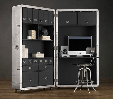
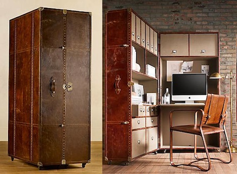
Blackhawk and Mayfair Secretary Trunks
Would you like a new desk or cubicle? What if you could have one of these two designs? The Blackhawk Trunk is “inspired by the gleaming nose cones and fuselages of mid-20th-century aircraft” and the Mayfair Trunk “spares no detail with handmade distressed cigar leather, a solid wood frame and over 3000 hand-hammered brass nail heads.” Both are gorgeous and would look great in your home or office!
Photoshop CS6 beta download
Adobe posted a beta of the upcoming version of Photoshop CS6 on its labs web site.
Terminator-like art
Very cool.
Flash-centric misconceptions of HTML5
Webdesigner Depot:
As developers, we have our own set of misguided beliefs about a certain technology, but as we begin to use that technology we are able to understand what it is all about, its usage, and its scope.
If it can be done on HTML5, then I’ll consider it.
The LIFE Notebook
Unchanged since 1951.
Condensed fonts
Condensed variations of most fonts should be used sparingly or avoided altogether in most design projects with blocks of text. Although there are a wide-range of excuses to use them there is a simple reason why you should not: Condensed fonts can be very hard to read.
The user designer disease
The disease is a designer killer. It’s a skills killer and most importantly it’s an imagination killer. Like the chicken pox, the “user design” disease is something we all need to get in order to become healthy, happy designers.
QR codes on business cards
I’m not a big QR code user, but I can see how this would be useful for some people.
Design landing pages
Having knowledge on how to create an effective landing page can increase the number of site visitors that take the desired action of the web page. Lets discuss factors and considerations that can lead to a better landing page design.
The iPad of 1935
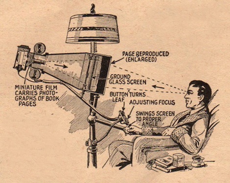
Smithsonian:
The April, 1935 issue of Everyday Science and Mechanics included this nifty invention which was to be the next logical step in the world of publishing. Basically a microfilm reader mounted on a large pole, the media device was supposed to let you sit back in your favorite chair while reading your latest tome of choice.
Don’t show this to Michael Dell. He might think it’s a good idea and start making them.
The world’s most beautiful turntables
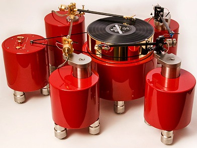
CNET:
The iPhone and iPad are truly elegant designs, but they are the rare exceptions in the rather drab world of consumer electronics. Most cameras, printers, computers, home theater receivers, and speakers are pretty sedate, but there is one product category that stands out: turntables. I’ve picked a choice selection that represents remarkable achievements in industrial design, and they’re highly functional, exquisitely engineered products.
If you have to check Wikipedia to find out what a “turntable” is, please ignore this article.
Pushing the limits of CSS3
Web Designer Depot: Don’t be mistaken though, CSS3 and CSS can’t do everything but, ironically enough, I doubt most of us are aware of its limitations or what pushes the very edges of its possibilities. Well, today we are here … Continued
Web design trends
I still like Letterpress. I can’t help myself, I think I’ll always like it.
CSS3 parallax content slider
This is very cool. Certainly doesn’t fit for The Loop, but it would for many other sites.
Using bold colors in Web design
As we look around the web, we see so many examples of designers who have brilliantly used color in web design projects to make the page or various page elements really pop. Even in some cases when we see designers opting for more minimal designs, using bold splashes of color can really take the look to fantastic new heights in very simple ways.
And I thought I was being bold with The Loop’s purple.
World’s coolest staircases
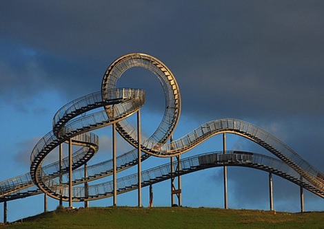
Yahoo! Travel:
While staircases are fundamentally a means to get from one point to another, they become cool—and worth seeking out—when the form is made at least as important as the function. Whether in shops, museums, or the great outdoors, the staircases we’ve found are inspiring works of public art and provide interesting perspective on a destination.
Even us lazy guys would enjoy taking some of these stairs.