Having the right color scheme is so important. I’ve visited Web sites that were designed well, but the colors were just horrible. It ruins the experience.
Design
Designing with a blank canvas
Some good tips when starting a Web site design from scratch.
Wacom entering the tablet market?
An interesting Tweet from the company’s Twitter account. Obviously raises a lot of questions.
The Loop’s responsive design is live
I mentioned a couple of months ago that one of the big changes coming to The Loop in 2013 was a responsive design, making it easier for people to read the site on mobile devices. That feature went live late last night. […]
Creating depth in Web design
Creative manipulation of images, from layering to composition to special effects, can add depth to web projects.
Tricks of the trade.
CSSmatic
This is really cool. Great tools.
37 Signal’s Ryan Singer on design practices
Great interview by Des Traynor.
CMYK playing cards
Very cool.
CSS3 image accordion
It’s cool, but I don’t know if I’d use it. A better question is what I’d use it for.
Skeuomorphism and busting myths
Not everything that Apple does in software design can be classified as Skeuomorphism. Louie Mantia does a good job of explaining it.
Video: Jony Ive talks Design and Blue Peter
This is the Blue Peter award video. Listening to Jony talk about design is amazing. […]
Jonathan Ive gets gold Blue Peter badge
The BBC’s Blue Peter programme has honoured Apple’s design chief Sir Jonathan Ive with its highest accolade – the gold Blue Peter badge.
Congrats Jony.
Being a great designer
Daniel Eden:
Let me begin by telling you the single most important thing you can do for yourself — recognise your fucking self worth. If you can’t value your own work, then who the hell will?
Another investor sues Apple
The new lawsuit, filed by an investor from Pennsylvania in U.S. District Court in New York, seeks to block Apple from moving forward with a February 27 shareholder vote on two proxy proposals.
One of the proposals is the same measure Einhorn targeted that would eliminate from the company charter Apple’s ability to issue preferred stock.
Skeuomorphism, what is it?
If you have any questions about Skeuomorphism, you should read this.
Creating a collapsing header effect
Very cool if you want to keep the menus available to your readers.
A guide to serif fonts
Even if you’re an experienced designer, it’s never a bad time to refresh your memory a little with the structure of serif typefaces, a few recommendations and a little history.
Effective use of whitespace in design
I love whitespace when it’s used properly. It’s such an integral part of a design that is often ignored.
Creating an email campaign with MailChimp
Here at MailChimp, we’re realists—as much as we love email and all the things you can do with it, we understand that building a campaign is a task, not a life event. You want to get in, get done, and get on with things. Duly noted.
Anyone that signed up for a membership would have gotten an email confirmation — I use MailChimp for that. Great service.
The secret to Apple’s designs
Tony Fadell:
“When you’re in a culture that has a point of view, and drives to launch everything it does, you know you’re on the hook and you better bring your best game every time.”
Grid-based layouts
Many designers use a grid as the foundation for every one of their designs. Some will use a 12-column grid, some will use a 16-column grid, some will use a 24-column grid, and others will use anything in between. The point isn’t so much the type of grid that you use, but the fact that you use one. Grids in web design are very common, and with the implementation of responsive web design, grids have become even more important than ever.
See the coolest feature of the 2014 Corvette Stingray
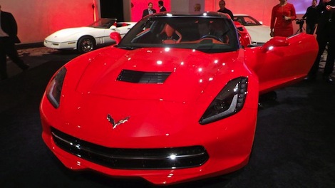 Mashable:
The 2014 Corvette brings many new features to the design of the iconic sports car: muscular lines, carbon-fiber parts and redesigned tail lights to name a few. But the most head-turning feature may be the…
I left off the “most head-turning feature”. Can you guess what it might be? The new ‘Vette is a top-to-bottom redesign, 450HP and the same in torque, around $50K, muscular look, reintroduced “Stingray” badging, longer, wider, etc, etc. Lots of “new” to this car.
But what does Mashable think is the most head turning feature? Watch the video and tell me at which point do you do what I did – yell, “GET OUT OF THE CAR, GEEK!”
Positives of negative space
Use of negative space is a factor that is often overlooked but just as, if not more, important than the physical aspects of a website.
Skeuomorphism in design
I like Skeuomorphism. I’m amazed at what designers and artists can come up with.
The importance of design to Apple
Nick Bilton:
What struck me about our brief conversation wasn’t that Mr. Cook was talking about two teensy buttons — this is Apple, after all — but that he never once mentioned the technology in the iPad Mini. Instead, he talked about one thing: design.
In all of the meetings I’ve had with Apple executives over the years, design is always one of the first things they talk about. There is an overwhelming sense of pride from everyone at Apple about the products they make.
Annotation overlay with CSS3
Very well done.
Design Jargon Bullshit
Classic.
Designing the empty pages in apps
Empty states are places in apps that have no content or data. They are empty. A blank page. Traditionally empty states are overlooked as most designers focus on how best to display lots of content or data.
Great article. When I see an app where the empty pages have seen some attention, I’m confident that the designer has thought about the details of the app. Strangely, it’s these pages that often make you feel like the designer missed something.
Website usability tests
In one of the first usability tests I ever did, I met a lovely old lady who could not use a mouse. She kept lifting it in the air and pointing at the screen, speaking words of encouragement to the cursor. At the end of the test I got absolutely nothing, but she did think I was a “lovely boy” who should meet her granddaughter. Very quickly I learned the value of setting very clear criteria for participant recruitment.
That’s classic. Thankfully Damian Rees offers some tips to improve your results.
App design trends for 2013
Great article from Gannon Burgett.