How about that for a novel idea — design your blog so it’s better for the reader. There are a lot of great ideas and thoughts here. You don’t have to follow them all, but it’s a good read to get an understanding of what works for readers and publishers.
Design
Principles of flat design
Carrie Cousins looks at five characteristics of flat design.
MacBook Air in CSS3
Very impressive.
London’s Tube map done in CSS
That is very impressive.
iOS design in the future: Almost flat
This is along the lines of what I would expect in iOS. Not throwing everything away, but more updating and modernizing the interface.
Guide to CSS transitions
I love that these types of transitions no longer require Flash.
Apple moving its flagship San Francisco retail store
Moving into Union Square is great for Apple.
Truth in design
Ive is making the point that whilst embellishments (like skeuomorphic design elements) can be perceived as clutter, that’s not the core problem. The actual issue is that such designs focus on analogy rather than essence: a paper book itself, rather than the novel inside.
This is a great article from Matt Gemmell.
Learning to become a failure
Robyn Morris:
Being a good designer means having a spirit of exploration and being OK with the reality that things may not always end up how you planned.
That can be applied to many professions.
Typography for non-professionals
Seth Godin:
If you use a typeface that reminds me of the script on the menu of a French restaurant, then no, I’m not going to instinctively believe that you’re a good doctor. If you use a thin, elegant wedding invitation font in your Powerpoint presentation, you haven’t been clever, you’ve merely confused me.
So true. I see people do crazy things like this all the time and it just makes me angry.
What comes after flat design?
Geri Reid brings up a good question. Skeuomorphic design took the world on quite a ride, but it seems to be out now. While I don’t agree with her that Microsoft “struck a winning blow with the flat interface of Windows 8,” there is no doubt a change is coming.
I would like to see Apple update their interfaces, but not eschew Skeuomorphic elements altogether.
Remember Apple’s previous keynotes. The crowd didn’t roar and applaud for the flat design elements, they cheered when the Passbook app shredded a card with a realistic shredder that popped up on the screen.
Apple needs to refine that design, not replace it.
Design and business
Doug van Spronsen writing about Ron Johnson and JCPenney:
I am not suggesting that great design isn’t effective, quite the contrary. But if the root cause of the issue is deeper, it might be better to start the strategy process a few layers back.
Great article and I agree. Selling iPhones, iPods and iPads is fairly easy because they are great products — the business side of things was working. Couple that with well-designed retail stores and you’ve got a winner.
CSS3 animated image slideshows
More cool CSS3 magic.
Customize CSS buttons with pictogram icons
The finished product looks really nice.
Typography in Mobile Design
What makes mobile typography special is the restrictive nature of mobile screens; they are small and used in brightly lit areas so that it is difficult to see anything. Therefore, when it comes to typography for mobile devices you have to be very careful about how you go about it. Most people would agree that there are three big components that help making mobile typography great: size, contrast and spacing.
What is design?
A very interesting article by José Luis Antúnez. Every answer leads to another question, but they are all pieces that need to be worked out.
Skeuomorphs
Seth Godin:
The original CD ROMs, for example, often had a home screen that started with a bookshelf, and you clicked on the ‘book’ you wanted to ‘open’ (excessive use of quotations intentional). Here’s the thing: bookshelves are a great idea if you want to store actual books on an actual shelf. They’re a silly way to index digital information, though.
I agree that design can’t get in the way of how we use something, but Skeuomorphic design also adds a level of familiarity to the new digital products we’re using. I’m still a fan of using it.
Bad UX can kill a website
This actually happened. An e-commerce website had been designed and developed. Launch had been initiated, and it was abruptly taken offline in mid-air.
I can’t even imagine how heartbreaking that must have been.
How to create an app showcase with grid overlay
This looks great.
Negative space as a design tool
I am a huge fan of negative space in design.
In design, less is more
Jake Savin:
Software should empower you, not distract you. It’s a tool, and like any good tool it should feel like a part of you. Once you know how to use it, the software itself should fade into your subconscious.
Jake makes some good points.
Design thinking
I observed design students who were acting mindlessly, simply doing their assignments as presented. No creativity, no imagination, no questioning. That’s not what design thinking is about. As a result, I have changed my mind: Design Thinking really is special. Alas, it isn’t embraced by all designers, but where it exists, it is powerful.
Symbol fonts
Brian Suda for A List Apart:
Now it’s time we embrace the third epoch in performance optimization: symbol fonts.
Embedding a symbol font lets us move some of those tiny icons into a single font file rather than a sprite. This has the same caching and file size benefits as a CSS sprite, as well as some additional benefits we’re only now realizing with high-resolution displays.
User experience trends
I spent a lot of time thinking about the user experience when redesigning The Loop a couple of years ago.
A great UI is invisible
A really well designed user interface is one that goes unnoticed by the user, whereas a poorly designed user interface forces the user to pay attention to it instead of the content.
Absolutely.
Two-step verification for iCloud accounts
Apple has joined the growing list of companies offering two-step verification to secure user accounts. By enabling two-step verification, whenever you attempt to log in on a new device with your Apple ID, you will be asked to enter a 4-digit verification code. This code will be sent to a device that you have registered as a trusted device, such as your iPhone, via a Find My iPhone notification or SMS.
Rarely used CSS3 properties
There are some CSS3 properties that aren’t used as often as you would expect. Despite their rarity, they are extremely useful.
Refining simplicity in design
Jared Lewandowski explores something that’s become very popular in design — simplicity.
Skeuomorphic and digital interfaces in 2013
I’ve said it before, but I like skeuomorphic designs.
God’s Architect: Antoni Gaudi’s glorious vision
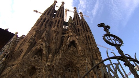 CBS News:
During his eight years as pope, Benedict XVI carried out thousands of official duties, but only once did he travel outside Rome to bestow the Vatican’s highest honor on a church, transforming it into a basilica — a sacred place forever.
I watched this last night and it’s a fascinating look at one of the world’s most beautiful and intricate buildings – and even after 130 years, it’s still not finished construction.