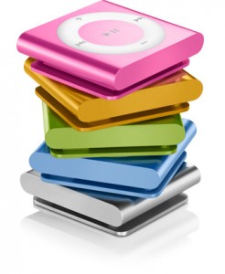
The redesigned iPod shuffle is quite different from its predecessor, and the addition of buttons on the face make it much easier to use. With VoiceOver, you have a great mix of navigating using the buttons and voice.  As I said in my iPod nano review, the iPod shuffle has been my preferred device because of its size and ease-of-use when traveling. I’ve become very accustomed to using VoiceOver and the headphones that include a Remote.
However, putting buttons on the iPod shuffle makes the device even more useful. I’ve found after using it over the past week that I’m reaching for the headphone Remote much less than I used to and I’m using the buttons on the shuffle more all the time.
Being able to break the habit of using the Remote so quickly showed me that the design change was a good one.
The buttons are all very familiar too, which makes it very easy to learn. As you can imagine, I don’t even look at the shuffle when I’m making changes, it’s all done by feel and touch.
The shuffle’s buttons are configured in the same way as the older click-wheel iPods. Play/Pause is in the center, Volume Up on top, Volume Down on bottom and Fast Forward, Rewind on the right and left, respectively.
The new iPod shuffle also includes a VoiceOver button on top of the device, which will tell you the current song and artist, playlist menu and the battery status. This is one function that I still find myself using on the headphone Remote, but that’s just habit on my part.
The shuffle also has a button on the top to turn the device off, shuffle and repeat.
The new iPod shuffle is a great device and does exactly what it should — gives you music when you want it, with the right controls to navigate to the songs you want to hear.
