About 24 hours ago I was sitting in a room with Apple executives with an Apple Watch on my wrist, flipping through the different screens and options. I was immediately more impressed with the watch than I was when the device was first introduced in September 2014.

I’ve maintained since it was first shown to the public that for Apple Watch to be successful, it would need to do more than just show a notification or alert from iMessage. I really wanted the watch to do something to make it an indispensable part of my routine, no matter where I was or what I was doing. That’s what I saw yesterday.
Features like summoning Uber from the watch, while a small thing, is quite fascinating. These are the types of tasks that are initiated from the watch—it’s not just a reactionary response to something happening on your iPhone. It certainly opens your mind to other greater possibilities from other apps. Typical of Apple, the implementation of this functionality is done in a very cool way.
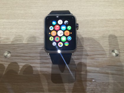
Of course, fitness is going to be a popular and great use of the Apple Watch. Being a walker myself, I’m looking forward to being able to better track my walks and the benefits I get from that exercise.
The simple fact that the watch screen is small, limits the amount of information Apple can reasonably display for the user. You could try to make everything smaller and cram as much into the UI as possible, but that would make it almost useless. These are the types of things that Apple thought about and implemented very well.
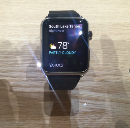
Even when you consider things like scrolling, you can see that Apple put considerable thought into how we would use the watch. For instance, you can scroll using your finger on the screen, much the same way you would with an iPhone, but if you wanted to scroll to the bottom of an email list very quickly, you can use the Digital Crown and be done in a jiffy.
There are other cool features too. I love the fact that you can mute an incoming call by covering the Apple Watch with your hand. That’s a level of detail that we only see from Apple these days. These are the types of “surprise and delight” features that become part of our everyday use.
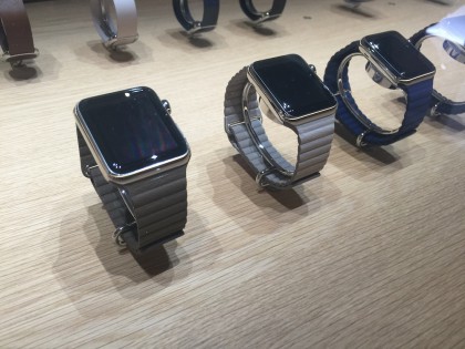
I was also surprised that you could use Apple Pay on the watch. I know I shouldn’t have been, but I was. All you need to do is double-tap the button on the side of watch and your Apple Pay cards are up on the screen. Swiping left or right allows you to choose between the stored cards. They were very easy to see as well.
The prices of Apple Watch weren’t much of a surprise to me. What Apple announced at the event lines up pretty close to what I’ve been saying all along. Personally, I like the Apple Watch with the Milanese Loop—it will cost $699.
There have been some stories written that say the downside for Apple is that people will use their iPhone less often. I really don’t think those people understand the Apple Watch.
Apple Watch is an accessory for the iPhone. It’s meant to make your life easier and more convenient, not to replace the iPhone.
Personally, I don’t mind taking my iPhone out of my pocket to complete some tasks, like checking the time 1. However, the watch will make many of these tasks easier and less distracting. I can respond to an iMessage using one of the auto respond answers very quickly and get back to what I was doing.
I don’t think Apple is concerned that you won’t be taking your iPhone out of your pocket as much as you used to—they are more concerned that you are using their devices in the most efficient way possible.
That’s what Apple should be concerned about.
Update: fixed the price of the Apple Watch.
Checking the time leads to responding to an iMessage, which leads to checking mail, which leads to responding to a tweet, and so on. I just wanted to know what time it was and all of a sudden, you’re “that guy” sitting at the table with his phone in his hand. ↩
