When I look at Apple software and hardware, I’m amazed with the simplicity of what sits before me. It’s not simplicity that makes you wonder what to do with it and it’s not simple for the sake of being simple. It immediately makes sense. That sense of wonder is replaced by a need to touch it and interact with it.
Apple products offer a sense of clarity not found in most products on the market today. Clarity of design, clarity of purpose and clarity of function.
This is why a young child can sit down in front of an iPad and instantly know how it works. On the same device, an executive can parse data and make business decisions that affect thousands of employees. It’s clear to both of these groups—and many others—how it works.
New customers to Apple will often ask me how they find something in a Mac or iOS app, or how they do a certain task. My answer has been the same for years: “Think of the simplest way to do it. That’s the way Apple will do it.”
More often than not, I’m right. If you ask someone what they believe the simplest way to get something done is, they will usually find it. Ask them the same thing on a PC and they could be lost for days.
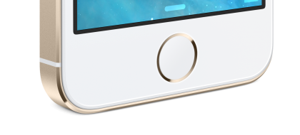
Consider the iPhone. It has one button. If you put an iPhone in front of someone that hasn’t used it before, they know instinctively what they should do. Pressing that one button opens up a whole new world. There is nothing else they can do, but to press on that button. It’s simple, it’s clear, and it works.

The most daunting task for any company is to make their product so intuitive that any person, anywhere, will be able to pick it up and start using it. Apple has been able to do that in a way that has shaped an entire industry.
Providing that clarity isn’t as easy as some may think. Microsoft, for example, tried to make Windows 8 simple—one operating system for every device. No Compromises. On the surface (no pun intended), this sounds like a noble goal. The mistake they made is trying to shoehorn a software product into a device that it wasn’t meant to fit in. The proverbial square peg in a round hole.
Microsoft did its best to convince people that having one OS was the best option for every aspect of your life. It wasn’t. Software that isn’t made for a touch-enabled device provides endless hours of frustration—you feel as though your on a desktop; the software is made for a desktop; but it wants you to tap like a tablet. Confusion and frustration ensues.
One of the triumphs for Apple over the last decade was providing users with powerful software with a very simple interface. iPhoto, iMovie, Keynote and others showed people that software didn’t have to be complicated to be useful. That’s not to say that Apple’s consumer-level software isn’t powerful, because it is.
GarageBand, for example, uses the same audio engine found in Logic Pro, Apple’s professional digital audio workstation, but GarageBand has allowed millions of musicians to record music easily.
Generally, people don’t care how something is executed once they click or tap on an application button. The fact that it’s done and the results are what they expected, is more than enough. Apple understood that and made it an integral part of its software strategy.
Clarity also extends to the product line itself. If you want an iPhone, you have two choices: the newest iPhone 5s or the iPhone 5c. Very clear and simple choices. The differences in these choices are also very clear—The iPhone 5s provides newer hardware features like Touch ID. If you want the latest and greatest, then that’s the phone for you.
Compare that to Samsung’s Galaxy S4. Even sites that regularly report on Samsung are frustrated with the over one dozen models available for sale.
Companies like Samsung throw out as many products as they can and see what sticks. To me, this shows a complete lack of confidence in what they are offering in their product line. When you add Android’s lack of upgrades for certain models, you end up with the complete opposite of everything Apple offers to its customers.
Knowing your future upgrade path, operating system support, app ecosystem, and indeed, what you can actually do with the device, provides something that everyone else is missing: Clarity.
