After Apple’s Worldwide Developers Conference ended, Apple supplied me with a 13-inch MacBook Pro and a copy of OS X Mavericks to evaluate and post my thoughts on The Loop. The version of Mavericks I tested was newer than the one released at WWDC, but not as new as the one released on Monday.
I’ve been using Mavericks as my only computer, doing my daily work on the web site, preparing The Loop Magazine for publication, interacting on social networks, listening to music and everything else I would normally do in the run of a day. For me, this was the only way to truly evaluate what the operating system could do.
I have my workflow down to a science now and I don’t really like to deviate from that too much. While this first look isn’t about third-party apps, I did want to note that I have not come across a single app that would just flat out not work under Mavericks. It’s an important consideration when looking at an operating system, so I thought I’d mention it.

Of course, there are some bigger features to look at, but Apple is famous for adding those little details and touches to OS X that make things a little easier for the user. One such detail in Mavericks happens after the install a new application—if you open LaunchPad, the new app has “magic dust” circling it, showing the user that the app has been newly installed and not yet opened. Not a huge feature, but a nice little touch.
The New Features: The Finder
One of the features that excited the crowd at WWDC was the ability to have tabs in the Finder. If you’re used to having multiple Finder windows open on a regular basis, you will really enjoy this feature.
Finder Tabs allow you to have multiple tabs in one Finder window. You can have different views for each tab—one tab can be in icon view, while the other can be in list view sorted by date—depending on your needs.
The tabs aren’t just for looks or for giving you the ability to avoid opening multiple windows, you can do things with the tabs too. For instance, you can copy or move files between tabs by simply dragging a file from the window of one tab to the title bar of another 1.
Another enhancement to the Finder is the addition of tags. Anyone who’s ever worked on a blog knows all about tags—and probably hates them. They sound like a good idea at the time, but they soon become more hassle then they’re worth. This was my thought when I started using Finder tags.
I will admit that Finder tags are a lot more useful than Web site tags. In the Finder I’m looking for a specific piece of information or document that I absolutely need. That makes tagging more important. However, I’ve been using Spotlight search for years and it is so good at searching—even within documents— that I’m not sure I need the extra help of tags to find what I’m looking for. Of course, the one thing Spotlight can’t do is find groups of documents—here, tagging would excel.
iCloud Keychain
If there’s one feature that stood out to me during the WWDC keynote, it was iCloud Keychain. If you’ve ever been on your iPhone or iPad and tried to remember any of the more complicated passwords you have, then you feel my pain.
Like many iOS and Mac users, I own many copies of 1Password. It’s an incredibly good app and it syncs between all of your devices, but it can’t give you access to your passwords from within Safari on iOS. I understand that it’s not their fault, but as a user, that’s the type of functionality I really want.
If I’m going to keep all of my sites and data protected with hard-to-crack passwords, there has to be a convenient way to retrieve them. iCloud Keychain promises to do that.
With iCloud Keychain, passwords you store on your Mac will be synced with the iOS devices you chose. Just like on your Mac, when you go to a Web site on your iOS device, iCloud Keychain will fill in the information for you. In other words, it will be available in Safari on iOS.
iCloud Keychain uses 256-bit AES encryption and the information is always encrypted on your devices.
Notifications
I said when OS X Mountain Lion was released that notifications was one of the my favorite new features. Having notifications popup meant that I didn’t have to waste time looking at my email, chats or Twitter whenever I heard the chime of a new message. All I had to do was look at the notification and keep working if it wasn’t important.
If it was important or it was something I wanted to act on right away, I would go to that app and respond. The new Notifications takes that a step further and makes them even better.
Now, when a notification comes up, I can click on it and reply on the spot. I don’t need to go to the app. This is incredibly convenient and productive. While it does take a couple of seconds to send off a quick response, I never leave the app I’m working in and I don’t lose my concentration.
Calendar
There are a couple of new features in Calendar that users will like a lot.
Continuous Scrolling is the one that I find most useful. My calendaring needs aren’t as extreme as some people that have a lot of meetings lined up everyday, so I tend to take a longer view of things. Having the ability to continuously scroll weeks or even months makes the calendaring tasks I do much easier.
The event inspector in Calendar is new too and includes Maps integration, travel time and address autocomplete. Again with most of my meetings happening over the phone, these features won’t mean a whole lot to me, but I can definitely see how they would be useful.
Maps
Maps looks great. I’ve been having a great time searching for places, but that’s not what will impress you about Maps.

Maps has a new feature in Mavericks that will allow you to send the address you are searching for to your iOS devices. This is obviously a very smart thing to do.

Like most people, if I’m going somewhere, I’ll search on my computer before I leave, not on my iPhone. With Maps, you can choose to send those directions to your iPhone, so you just have to tap and you’re away. I love that.
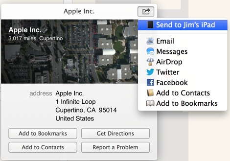
Maps is also integrated throughout Mavericks, so it becomes one of those features that’s everywhere.
Design
While OS X Mavericks looks very similar to Mountain Lion, there have been some design changes.
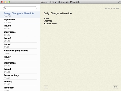
The changes seem most prominent to me in the Notes, Calendar and Address Book apps. That makes sense because they were arguably the apps that had some of the most skeuomorphic elements in them. Gone is the stitching and ruled paper—it’s replaced with nothing, really.
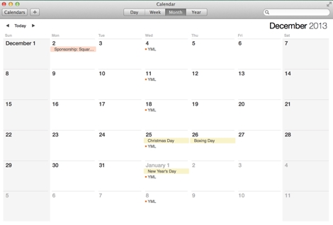
I find Calendar and Address Book a bit too stark for my tastes. It’s like loading a Web site without the CSS—it seems like there was too much taken away. However, I don’t mind Notes. Maybe it’s just the fact that they left some color in there that makes it work for me.
It will be interesting to see what the finished product looks like.
Integration
The real shining point of Mavericks is the continued integration between OS X and iOS. Whether it’s Maps directions shared to your mobile device or passwords being synced from your iPhone to your Mac, Apple is making their entire ecosystem work for the user.
To be clear, I see this as more of an integration of the user’s information, not the two operating systems. Apple is using the best operating system for mobile and desktop uses, while allowing the user to sync information between the two.
We use Apple products because they make it easy to access our information no matter where we are—on our MacBook, iMac or on the go with an iPhone or iPad. Everything syncs, everything is the same no matter where you are, and that’s important.
Apple’s ecosystem and infrastructure are things that it’s competition are trying desperately to replicate, but haven’t quite been able to do. Apple’s continued integration of information will continue to set it apart moving forward.
Update: I clarified that 1Password couldn’t give you access to passwords within Safari in iOS.
This is one of the reasons I often have many Finder windows open on my Mac. ↩
