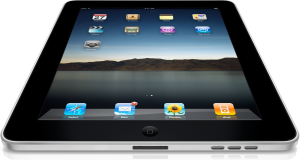
The iPad may not be for everyone, but usability expert, Jakob Nielsen, said in a recent report that the iPad’s interface is whacky. “iPad apps are inconsistent and have low feature discoverability, with frequent user errors due to accidental gestures,” said Nielsen. “An overly strong print metaphor and weird interaction styles cause further usability problems.”
 In a story on Betanews on Tuesday, Joe Wilcox says he agrees with many of Nielsen’s findings — part of his report is titled “Wacky Interfaces.” Wilcox says he likes that he can use his fingers on the iPad, but often accidentally taps links with his fingers when he meant to scroll through a Web page.
I admit, I have touched the iPad screen and mistakenly clicked on a link, but it’s not something I do all the time. The more I get used to it, the easier the iPad is to use.
I also don’t mind the print metaphor in a lot of the apps. It’s not confusion, but rather familiar. I know that swiping pages means I go to the next page. It makes sense.
I’m not sure what features Nielsen is expecting to uncover in the iPad’s apps that are hidden, but for the most part, the features tend to be easy to find.
